You are using an out of date browser. It may not display this or other websites correctly.
You should upgrade or use an alternative browser.
You should upgrade or use an alternative browser.
Colorblind?
- Thread starter Max
- Start date
Red / Green problems here also, as about 8% -9% (!) percent of people.
Problem is to distinguish red and grenn if they are close together, or if a Sign / Symbol / Icon is shown sometimes in Red and then in Green. Simply don't recognize it. So somtimes "warnings" and "statuses" are not recognized by me. Wisch ther would be different geomtries for differrent states or different colors which are easier to distingish.
Side note: Driving a car cause no problem.. The light on top is red, the light on the bottom is green. But running a railroad engine would be desaterous, in Railroad (at least here in Germany) there is one light that switches from green to red... thats why I stay on the road.
BR
Stefan
Ralf
Alibre Super User
Hi Stefan,
Just a hint, I don't know if it actually helps:
Windows 11
Please take a look:

Shortcut: Windows logo + U
In English:
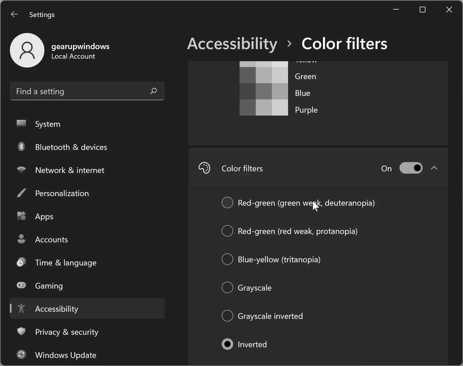
 gearupwindows.com
Just a hint, I don't know if it actually helps:
Windows 11
Please take a look:
Shortcut: Windows logo + U
In English:
How to Enable or Disable Color Filters in Windows 11? | Gear Up Windows
Learn how to enable or disable color filters in Windows 11 with our simple guide. Customize your display and improve accessibility with a few simple clicks.
gearupwindows.com
Last edited:
motoxmuseum
Member
I am red-green color blind and find the color combinations used in Alibre a challenge. I am a daily user and happy to give feedback.
Thanks for all the readiness to help!
Overview of this project:
Over the next 2 releases, we will be migrating all icons and dialogs to be SVG (vector) based instead of image based. This will result in AD having an entirely different, yet familiar look and feel. Streamlining and consistency in the UI is a top priority. However, we get some cool side benefits to this project. One is that all icons will look very crisp at all times on every resolution. Another is that we can programmatically change the colors in the icons based on the color scheme selected by the end user. So for example, a color scheme for red-limited vision would go into each icon and replace the red with a yellow, perhaps.
Timeline
Phase 1 of this project should ship next release, which is the SVG-ification of the icons. We will be creating several (?) new color schemes specifically for colorblind folks.
When we have the basic icon work done and the icons are able to be changed via color schemes, I will reach back out here because then I will have something to show you. This is perhaps 4-6 weeks out. We can discuss whether we need multiple color palettes based on different kinds of colorblindness, or whether a common colorblind palette is sufficient.
Some research I've been looking at:


 thenode.biologists.com

 venngage.com
Examples
This is an example (that is probably not very good) of how we might map our new regular/muted colors which all the icons will be from (top) to a colorblind palette (bottom). Just a quick first take, and it's quite possible the mapping below results in total nonsense visually, but until I can see the final icons with the new mapping it's hard to tell. What is more important here is whether you can easily distinguish between all the colors in the bottom color palette.

How you can help right now
If you happen to have examples of good color palettes for your specific flavor of colorblindness that you can very easily distinguish, please post a link to it as well as describe which flavor of colorblindess you have.
See you guys in a few weeks
Overview of this project:
Over the next 2 releases, we will be migrating all icons and dialogs to be SVG (vector) based instead of image based. This will result in AD having an entirely different, yet familiar look and feel. Streamlining and consistency in the UI is a top priority. However, we get some cool side benefits to this project. One is that all icons will look very crisp at all times on every resolution. Another is that we can programmatically change the colors in the icons based on the color scheme selected by the end user. So for example, a color scheme for red-limited vision would go into each icon and replace the red with a yellow, perhaps.
Timeline
Phase 1 of this project should ship next release, which is the SVG-ification of the icons. We will be creating several (?) new color schemes specifically for colorblind folks.
When we have the basic icon work done and the icons are able to be changed via color schemes, I will reach back out here because then I will have something to show you. This is perhaps 4-6 weeks out. We can discuss whether we need multiple color palettes based on different kinds of colorblindness, or whether a common colorblind palette is sufficient.
Some research I've been looking at:
Coloring for Colorblindness
This interactive visual tool lets you see how accessible your color palettes are to viewers who are colorblind.
davidmathlogic.com
Color blind friendly palettes for data visualizations with categories
A discussion of color blind friendly palettes for labeling unique catergories in data visualization.
thenode.biologists.com
How To Use Color Blind Friendly Palettes in Your Design - Venngage
Learn to design inclusive charts using color-blind-friendly palettes and enhance accessibility effortlessly with Venngage's Accessible Design Tool.
Examples
This is an example (that is probably not very good) of how we might map our new regular/muted colors which all the icons will be from (top) to a colorblind palette (bottom). Just a quick first take, and it's quite possible the mapping below results in total nonsense visually, but until I can see the final icons with the new mapping it's hard to tell. What is more important here is whether you can easily distinguish between all the colors in the bottom color palette.
How you can help right now
If you happen to have examples of good color palettes for your specific flavor of colorblindness that you can very easily distinguish, please post a link to it as well as describe which flavor of colorblindess you have.
See you guys in a few weeks
Old Geeser
Senior Member
I am black/red color blind and have some trouble with the present color scheme. I did change the "completely constrained" color from black to blue. I am new to Alibre so some of the issue is unfamiliarity and will improve as I learn. All the colors in the above message appear very distinctive to me (the 1st and 3rd are better with the third best). If there is any way I can help just let me know.
Toybuilder
Senior Member
Not directly related, but has the supressed/hidden text label grey a lighter shade than before in V25? For some reason, I feel like I can't read the text as well as I used to before.If you're colorblind and willing to give feedback on some colorblind-friendly changes we're considering, pls let me know.