You are using an out of date browser. It may not display this or other websites correctly.
You should upgrade or use an alternative browser.
You should upgrade or use an alternative browser.
Web Font Suggestion
- Thread starter GIOV
- Start date
Re: Web Font Sugestion
Thanks for your suggestion. We cannot change the logo - it is decided on.
Part of what went into our logo design was fulfilling several criteria:
And a few others. What is not on that list is "it should be cool" - though we value coolness as much as the next guy/girl. This font is cool, but doesn't do a good job of representing the brand we're going after. I wanted to thank you for your feedback, and give you the rationale behind why we chose what we chose.
Cheers,
Max
Thanks for your suggestion. We cannot change the logo - it is decided on.
Part of what went into our logo design was fulfilling several criteria:
- It should be easy to understand
- It should feel approachable
- It should feel friendly
And a few others. What is not on that list is "it should be cool" - though we value coolness as much as the next guy/girl. This font is cool, but doesn't do a good job of representing the brand we're going after. I wanted to thank you for your feedback, and give you the rationale behind why we chose what we chose.
Cheers,
Max
NateLiquidGravity
Alibre Super User
Re: Web Font Sugestion
Did anyone try building the A logo in Alibre Design? It seems more like a freeform sculpture than a mechanical CAD design to me. I realize it is probably too late now but something to consider for the future.
Did anyone try building the A logo in Alibre Design? It seems more like a freeform sculpture than a mechanical CAD design to me. I realize it is probably too late now but something to consider for the future.
Andrew Roth
Senior Member
Re: Web Font Sugestion

That Sounds Like an interesting design challengeDid anyone try building the A logo in Alibre Design? It seems more like a freeform sculpture than a mechanical CAD design to me. I realize it is probably too late now but something to consider for the future.
Dave H
Senior Member
Re: Web Font Sugestion
It would be interesting to be able to 3D print, or CNC cut that logo if it does get modeled!
Andrew Roth said:That Sounds Like an interesting design challengeDid anyone try building the A logo in Alibre Design? It seems more like a freeform sculpture than a mechanical CAD design to me. I realize it is probably too late now but something to consider for the future.
It would be interesting to be able to 3D print, or CNC cut that logo if it does get modeled!
GIOV
Alibre Super User
Dave H said:Andrew Roth wrote:
Did anyone try building the A logo in Alibre Design? It seems more like a freeform sculpture than a mechanical CAD design to me. I realize it is probably too late now but something to consider for the future.
That Sounds Like an interesting design challenge
It would be interesting to be able to 3D print, or CNC cut that logo if it does get modeled!
DaveH,
Home work in Titanium
May you vary the units.
I hope the Alibre Team likes you CNC model!!
Attachments

Dave H
Senior Member
GIOV said:Dave H said:Andrew Roth wrote:
Did anyone try building the A logo in Alibre Design? It seems more like a freeform sculpture than a mechanical CAD design to me. I realize it is probably too late now but something to consider for the future.
That Sounds Like an interesting design challenge
It would be interesting to be able to 3D print, or CNC cut that logo if it does get modeled!
DaveH,
Home work in Titanium
May you vary the units.
I hope the Alibre Team likes you CNC model!!
I meant the new Alibre 'A'. Sorry for the confusion.
GIOV
Alibre Super User
I understand.Dave H said:I meant the new Alibre 'A'. Sorry for the confusion.
Here is an idea of Alibre "A"
Attachments

GIOV
Alibre Super User
Ok Max,Max said:Thanks for your suggestion. We cannot change the logo - it is decided on.
Part of what went into our logo design was fulfilling several criteria:
It should be easy to understand
It should feel approachable
It should feel friendly
And a few others. What is not on that list is "it should be cool" - though we value coolness as much as the next guy/girl. This font is cool, but doesn't do a good job of representing the brand we're going after. I wanted to thank you for your feedback, and give you the rationale behind why we chose what we chose.
Cheers,
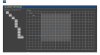
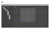
To conclude, This is my contribution for Alibre Design Interface. The Alibre Design may be replaced by the Alibre "A" gem
Contect Menu, Design Explorer and Ribbon on semi-transparent board.
Cheers