What's new

UI Feedback requested :D

Max

Administrator
Staff member
Edit: I changed the image to better represent the nature of the choices we are discussing since the initial example did a poor job of conveying this.

Hey everyone,

Continuing to toy around with the new dialog structure and wanted to float an idea and get some feedback.

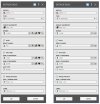
Inputs can have a Flip button, which flips the sign. An Equation Editor button. Soon to be a Favorites button and potentially an "input by measurement" button - getting to be a lot of buttons for each input - an example of this is the image on the left.

On the right, I've reimagined this to consolidate all that functionality into a single button. My thoughts are that there are a lot of things you can do on any given input, and adding a new button for each one will quickly get out of hand as we expand the functionality.

The choices we're describing here are effectively a tradeoff between single-click access and busyness on the screen with potentially dozens of extra buttons in some dialogs.

In any case, what are your thoughts on this approach to inputs? Love it, hate it, have any other ideas? What CAN you realistically live without regarding single-click access? What will you mutiny over if you don't have single-click access to it?

Note this image is photoshopped, so it's not perfect, but gives you the general idea.
exampledialog.jpg

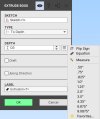
What happens when you click the single-button:
dropdown.jpg
 
Last edited:

Ex Machina

Senior Member
I don't like it, I don't hate it...

Why not put the tape-measure icon and the f(x) icon floating inside the textbox. It would look cleaner, imho. And then you can enlarge the textbox too. Even a row of buttons underneath the textbox would be better for me personally. Or even a second tab labeled "Advanced" like you have in the flange tools, and the Helix tool, etc.

In any case, adding a parameter from the Equation Editor being 2 clicks instead of 1 is something that would probably annoy me greatly. lol
 

Stu3d

Senior Member
I don't like it, I don't hate it...

Why not put the tape-measure icon and the f(x) icon floating inside the textbox. It would look cleaner, imho. And then you can enlarge the textbox too. Even a row of buttons underneath the textbox would be better for me personally. Or even a second tab labeled "Advanced" like you have in the flange tools, and the Helix tool, etc.

In any case, adding a parameter from the Equation Editor being 2 clicks instead of 1 is something that would probably annoy me greatly. lol
I agree, there are certain things that are used often and should be very quick to access like equation editor and flip, bury the more obscure items. Favourites should be quick to access too.
 

stepalibre

Alibre Super User
I don't like it, I don't hate it...

Why not put the tape-measure icon and the f(x) icon floating inside the textbox. It would look cleaner, imho. And then you can enlarge the textbox too. Even a row of buttons underneath the textbox would be better for me personally. Or even a second tab labeled "Advanced" like you have in the flange tools, and the Helix tool, etc.

In any case, adding a parameter from the Equation Editor being 2 clicks instead of 1 is something that would probably annoy me greatly. lol
Yes, equation editor, flip and favs buttons should be on the form and the list of size increments could stay as is.
 

Max

Administrator
Staff member
I think I should have done a better job at communicating initially, at a minimum showing some contrasting options. What I'm hearing here is expected - that you want fast access to all of this stuff with 1 click.

That being said, to surface Eq Editor, Favorites, Flip, and eventually Measure (or any other things), we start to need 4 buttons per input control. That means that dialogs start to look like the one on the left:

exampledialog.jpg

Some dialogs with tons of inputs all having 3-4 buttons to surface everything all the time begins to potentially become a problem. Or, if not a problem, it at least looks to my eye like something different should be considered.

So with this example in mind, does this change anyone's calculus?
 

Stu3d

Senior Member
Left dialog looks good to me. I would even go as far as having a row of icons for Type (to depth, mid plane etc) as these are changed almost every extrude and it would then be one click, like when inserting a new plane.
 
  • Like
Reactions: tyc

Ex Machina

Senior Member
I say, Left Dialogue but with the buttons underneath the textbox. It'll be more accessible to newcomers too. Otherwise, people will need to read up or click random things on the menu before they can find the measure, Eq Editor and reverse options.

P.S. If you're worried about overall height, why not make it 2 columns..?
 

DavidJ

Administrator
Staff member
Can some of these buttons also be tied to keystrokes? (especially if you go with the drop-down list).

Personally I'm not sure about the 'chain link' icon for Equation Editor - particularly as it already has another meaning in the software. Is there a problem with the current icon?

For me Flip and Equation Editor are most frequently used and should be single clicks.
 

Cator

Senior Member
I agree about the graphic coherence and the importance of the equations and the visibility of the buttons (ouch ouch how much the 2D offset is missing)
 

NateLiquidGravity

Alibre Super User
Here's my $0.02
Get rid of all the spinner button and functionality. I only notice it exists when I accidently leave focus there while I scroll. Does anyone use it?
Put the flip buttons in it's place.
Put the equation button next to that.
Put the measurement button next to that but make it open the dropdown with measure at the top and then the favorite.
 

Max

Administrator
Staff member
Can some of these buttons also be tied to keystrokes? (especially if you go with the drop-down list).

Personally I'm not sure about the 'chain link' icon for Equation Editor - particularly as it already has another meaning in the software. Is there a problem with the current icon?

For me Flip and Equation Editor are most frequently used and should be single clicks.
Yeah ignore the current icons you’re seeing those are just placeholders.
 

jc-s

Member
What about an option in preferences which lets you choose which functions are always available; the others are available in the menu button? The default can be whatever we deem most sensible, but then it gives some options and lets it evolve without being set in stone.
 

albie0803

Alibre Super User
Get rid of all the spinner button and functionality. I only notice it exists when I accidently leave focus there while I scroll. Does anyone use it?
All the time, I miss them when I need to use Inventor.

Maybe just have 3 buttons, Flip, Fx and Menu. This keeps the commonly used ones accessible and puts everything else in the drop menu
 

HaroldL

Alibre Super User
:eek: Just how big are these dialogs going to be? They look massive in my browser zoomed to 100%. As far as the dialogs getting too long, those in SolidWorks get pretty long when you start selecting all the options so I'm not opposed to them growing as options are selected.
Can the text be the same as that in current version? This just looks odd. :confused:
I rarely use the spinner buttons, I just click in the text box and update the value or enter a new one. But if it stays it will not look like something is missing.
The most used buttons should be 1-click, the lesser used could be on a drop-down menu.
Do the text boxes need to be full width? They could be shorter allowing room for the buttons.
I'd like the Type to be 1-click radio buttons, I get tired of having to click the drop-down to get the type I need/want. That would be 5-6 buttons depending on Boss or Cut.
 

Max

Administrator
Staff member
:eek: Just how big are these dialogs going to be? They look massive in my browser zoomed to 100%. As far as the dialogs getting too long, those in SolidWorks get pretty long when you start selecting all the options so I'm not opposed to them growing as options are selected.
Can the text be the same as that in current version? This just looks odd. :confused:
I rarely use the spinner buttons, I just click in the text box and update the value or enter a new one. But if it stays it will not look like something is missing.
The most used buttons should be 1-click, the lesser used could be on a drop-down menu.
Do the text boxes need to be full width? They could be shorter allowing room for the buttons.
I'd like the Type to be 1-click radio buttons, I get tired of having to click the drop-down to get the type I need/want. That would be 5-6 buttons depending on Boss or Cut.

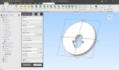
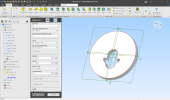
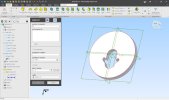
The size of the pictures doesn't correlate in any way to what it will look like in the product. Some examples of sizing are here, as actually implemented. Some dialogs like Helix and Hole will be long and likely have scroll bars. Most will not. Also depends on your resolution and monitor DPI - I run mine a little "bigger" than what is probably average for the display I'm using, so my dialogs (and every other UI element) will take up more space compared to what yours might. Some *cough* totally normal people run 4k at 100% and all this will be tiny. So really just depends.

These are some of the longer ones we currently have implemented, Most will be shorter. And even these will be shorter most of the time, unless you use all the options all the time.

a.jpg
aa.png
aaa.jpg

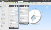
There is also a Compact mode for folks who want dialogs to consume as little space as possible. An example:
compact.jpg
 

Max

Administrator
Staff member
Yes, I agree.

I think I am going to try to advocate for options related to this question. If you want, you should be able to see the 3 buttons. If you want, you should have it in a single button. I'll ask development about how realistic this is given time constraints, and we will err on the side of 1-click access for more things probably if we cannot make it optional.
 

domcm

Senior Member
All the time, I miss them when I need to use Inventor.

Maybe just have 3 buttons, Flip, Fx and Menu. This keeps the commonly used ones accessible and puts everything else in the drop menu

@Max

First, thanks for the opportunity to provide feedback on the new menus.

Another vote for just Flip, Fx and Menu. Too many icons starts to look cluttered to me.
 

HaroldL

Alibre Super User
I think I like the size of the Compact mode but will wait for another look when buttons are determined.
What about the fonts? It looks out of phase with the rest of the UI. I think using the same fonts as the DE and UI would make for more unified appearance.
 
Top