What's new

UI Feedback requested :D

dwc

Alibre Super User
"Many dialogs today are haphazardly laid out and contain various dialog states simultaneously, showing inputs that are not available to use but offering no suggestion as to why. A goal is to make inputs completely self-evident. A simple example on Extrude is the Offset input, which is grayed out unless you happen to have To Geometry selected. It can be frustrating and time-wasting to try to figure out why things can't be used. The new layouts make significant progress in this area, showing only controls that can be used at the time based on the previous selections."
IMHO this is absolutely the wrong way to attack this. You are removing the tel-tail signs that tell me as a user that this functionality is available. I may have to look to find out how to use it, but if all is hidden I have no idea that the functionality is there somewhere.
When grayed out I can see that this is possible with the right inputs, when not shown at all I would have to memorize the users manual.
The only thing that is self-evident is the default case.

 

Max

Administrator
Staff member
@Max

I really appreciate your very detailed response for the interface design goals! That makes a lot of sense and helps me understand the overall plan.

One thing I didn't appreciate when I looked at your original images is that it looks like the dialog boxes start shorter and then grow longer as you check feature options such as Draft, Thin Wall, and Along Direction. Am I seeing that correctly? If so, that will allay most of my concerns about the new menus taking up more screen real estate.

Yes, I intentionally showed them in their most expanded states, or close to it. Most people will not have most things expanded most of the time.
 

Max

Administrator
Staff member
I may have to look to find out how to use it, but if all is hidden I have no idea that the functionality is there somewhere.

I don't necessarily agree, though I understand where you are coming from.

Let's take a simple example of Draft Angle. We don't show the Draft Angle numerical input by default. We do show a Draft Angle checkbox, which once you click it the Draft Angle gets shown.

This scenario plays out elsewhere in the new dialogs. Irrelevant inputs are hidden. Concepts are not hidden. All core concepts of what you can do are surfaced at all times in the dialogs. All the minutiae of the inputs associated with getting those to work are not.

For Thin Wall, you don't need to see the 3 inputs at all times, just the Thin Wall checkbox, to know that Thin Wall is available.
 

Stu3d

Senior Member
@Max
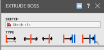
Any thoughts on replacing the Type drop down menu with a row of icons as a couple of us have mentioned?
This rough mock up I did fitted within the same space. There is probaly even space to add a short description beneath each icon.
I appreciate this forum represents a very small percentage of the Alibre user base and that any changes to the UI may concern the established professional users as it may slow them down but I imagine this change would be popular if you did a poll. I myself have been frustrated at times with the 2d cad package I use after an update, especially when we went from DOS to Windows!
The only downside I can see is it probably keeps the dialogue wider than you are aiming for and increases your programmers workload.

Alibre extrude menu1.png
 

NateLiquidGravity

Alibre Super User
I'm guessing all documentation, tutorials, videos, and such will be completely redone then as well? Please fix the confusion about what Atom3D can and can't do then as well.

EDIT:
Please also make sure that input boxes commit whatever was already input when the mouse leaves the form instead of canceling whatever was input like many forms currently do. We shouldn't have to tab out of the input box or click another control in the form to commit it.

Also please include highlighting/selecting of items in 3d when highlighting/selecting the items in multiple selection boxes.

EDIT2:
The book "Alibre Design: A Power Guide for Beginners and Intermediate Users" will be 99% obsolete too.
 
Last edited:
I say customization is king. I wouldn't change the UI all that much because there's such a goldmine of information on how to use Alibre on the YouTube channel and on this forum, but if a change must happen, the ability to customize which buttons appear where, and in what order, could be a really powerful thing for Alibre that other CAD softwares don't offer. For example, If I use the 'mid-plane' extrude all the time, but I never extrude 'to next,' maybe I could have the option to put 'mid-plane' as the default option and put 'to next' on the bottom.'

Overall, I honestly don't think there's much if anything wrong with the current design of Alibre's UI, and learning a new UI might be a turn-off for some current Alibre users. Changing some icons to look nicer is one thing, but changing their placement and whether they're hidden or not can get frustrating, especially to power users.

I really like how Alibre's UI looks now. Some of the dialog boxes can sometimes look a little dated, but they're still easy to use and I rarely question what something does. I'd rather have function than finesse.
 

Stu3d

Senior Member
EDIT:
Please also make sure that input boxes commit whatever was already input when the mouse leaves the form instead of canceling whatever was input like many forms currently do. We shouldn't have to tab out of the input box or click another control in the form to commit it.
This can be very annoying, especially in the hole tool.
 

Stu3d

Senior Member
I say customization is king. I wouldn't change the UI all that much because there's such a goldmine of information on how to use Alibre on the YouTube channel and on this forum, but if a change must happen, the ability to customize which buttons appear where, and in what order, could be a really powerful thing for Alibre that other CAD softwares don't offer. For example, If I use the 'mid-plane' extrude all the time, but I never extrude 'to next,' maybe I could have the option to put 'mid-plane' as the default option and put 'to next' on the bottom.'

Overall, I honestly don't think there's much if anything wrong with the current design of Alibre's UI, and learning a new UI might be a turn-off for some current Alibre users. Changing some icons to look nicer is one thing, but changing their placement and whether they're hidden or not can get frustrating, especially to power users.

I really like how Alibre's UI looks now. Some of the dialog boxes can sometimes look a little dated, but they're still easy to use and I rarely question what something does. I'd rather have function than finesse.
Change for changes sake is bad especially if it disrupts the workflow of long time professional users. Like Microsoft moving Windows 11 Start button in to the middle, yes there is a setting to move it back to the left but the power button is still on the right of that dialogue which is irritating.
Enabling the ability to customise which buttons go where would be a lot of work for Alibre I reckon. Doing away with drop down menus where possible (like the Extrude Boss dialogue mock up I did above) would speed things up without upsetting the established user base.
 

simonb65

Alibre Super User
@Max I'm a bit late tot he debate (vacation!), but with regards to your suggestions in post #1, I would say that rather than on the right image, instead of having the 'menu' as a click to open, just make it a hover over to show. That way the mouse clicks are still only one per selection AND it still allows for expanding the number of functions that each field can have ... OR just learn the users most clicked option (or 2) and always show that/those PLUS a hover over for more button. The UI can be smart, uncluttered and expandable without having to compromise too much for half the users and alienate the others! Yes, it's a bit more work for you guys, but things like a field textbox plus most used 2 buttons plus hover over for more should be a common control that can be reused throughout the application and all dialogs, so it's a one time dev effort for a big user UX return.
 

stepalibre

Alibre Super User
Please consider saving dialog options to a configuration file so we can script and automate dialog selections. It would help to allow for user-based options and settings. I can do this with Autohotkey/AutoIt and it shouldn't be too difficult for Alibre to store and load selections from a file per session and/or at launch.

Your last picked options can be saved and loaded next time. And it would be possible to have different configurations you can load for specific workflows. This can be done in-memory to not consistently save to disk, and save to file when the file/session is closed like other setting files.

Edit: I needed to take my daughter to school...

Overwriting of presets would need to be communicated somehow. I understand that the devil is in the details. However, if dialog settings are stored and loaded from a file, then users can customize their own experience.

If I have time I can make a demo for reference.
 
Last edited:

Stu3d

Senior Member
@Max I'm a bit late tot he debate (vacation!), but with regards to your suggestions in post #1, I would say that rather than on the right image, instead of having the 'menu' as a click to open, just make it a hover over to show. That way the mouse clicks are still only one per selection AND it still allows for expanding the number of functions that each field can have ... OR just learn the users most clicked option (or 2) and always show that/those PLUS a hover over for more button. The UI can be smart, uncluttered and expandable without having to compromise too much for half the users and alienate the others! Yes, it's a bit more work for you guys, but things like a field textbox plus most used 2 buttons plus hover over for more should be a common control that can be reused throughout the application and all dialogs, so it's a one time dev effort for a big user UX return.
Hover over to show menu sounds a good idea if drop down menus can't be got rid of.
Not sure about having the items reorder according to regular use, better to keep them in the same order as they are now so we can use our memory to go to the required item in the list quickly.
 

stepalibre

Alibre Super User
Please consider saving dialog options to a configuration file so we can script and automate dialog selections. It would help to allow for user-based options and settings. I can do this with Autohotkey/AutoIt and it shouldn't be too difficult for Alibre to store and load selections from a file per session and/or at launch.

Your last picked options can be saved and loaded next time. And it would be possible to have different configurations you can load for specific workflows. This can be done in-memory to not consistently save to disk, and save to file when the file/session is closed like other setting files.

Edit: I needed to take my daughter to school...

Overwriting of presets would need to be communicated somehow. I understand that the devil is in the details. However, if dialog settings are stored and loaded from a file, then users can customize their own experience.

If I have time I can make a demo for reference.
Dialog preset settings could also be a page on the System Options dialog. And the config file for dialog presets can be saved here: C:\Users\steph\AppData\Roaming\Alibre Design

Maybe this is a poweruser feature, but you can have the default configuration for users as a base.
 
Last edited:

stepalibre

Alibre Super User
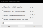
@Max and Team here is a working example/concept:

AlibreControlPresetSystemDemo.gif

Example form:

1708360348399.png
Saved and loaded data: FORMPRESET.txt

CheckBox4=False
CheckBox3=True
RadioButton4=True
RadioButton3=False
RadioButton2=False
RadioButton1=False
ComboBox1=5
CheckBox2=True
CheckBox1=False

Sourcecode:


Edit:

AlibreScript/AlibreX programs can use this concept for forms in scripts and addons.

This design means that it should work on any form, no need to think about the form layout, controls or design.

This is all meant to aid in the discussion and clearly show what I'm thinking. Thank you for allowing users to provide feedback in this way!
 
Last edited:

HaroldL

Alibre Super User
Hi @Max, I know you and your team are working to have a good product out of the gate. But can you give an update to how close you are to Beta with the next release.
 

evandene

Member
Edit: I changed the image to better represent the nature of the choices we are discussing since the initial example did a poor job of conveying this.

Hey everyone,

Continuing to toy around with the new dialog structure and wanted to float an idea and get some feedback.

Inputs can have a Flip button, which flips the sign. An Equation Editor button. Soon to be a Favorites button and potentially an "input by measurement" button - getting to be a lot of buttons for each input - an example of this is the image on the left.

On the right, I've reimagined this to consolidate all that functionality into a single button. My thoughts are that there are a lot of things you can do on any given input, and adding a new button for each one will quickly get out of hand as we expand the functionality.

The choices we're describing here are effectively a tradeoff between single-click access and busyness on the screen with potentially dozens of extra buttons in some dialogs.

In any case, what are your thoughts on this approach to inputs? Love it, hate it, have any other ideas? What CAN you realistically live without regarding single-click access? What will you mutiny over if you don't have single-click access to it?

Note this image is photoshopped, so it's not perfect, but gives you the general idea.

View attachment 40862

What happens when you click the single-button:
View attachment 40863
When a user has chosen ones for example the measuring tool, please leave it as the default value for next time use. (Also after closing the file)
 

J.M.

New Member
Sorry I'm late to this party. In an enhanced UI I would love to see:

- An easier way to rename things. Now, you have to right click features etc. and choose Rename. When you have dozens of things to rename, this gets very tedious. You can't even make a shortcut to do it. It would be nice to simply click on the feature and the name would be highlighted or at least make it possible to define a shortcut to use something like F2. Anything is better than a context menu only solution.

- Double clicking on an existing Sketch should open the Sketch Editor, instead of having to use a context menu and choose Edit.

- Double clicking any feature should invoke the feature editor instead of using a context menu to choose Edit. Again, this is time consuming.

- More use of dragging an arrow to quickly set features (like is done with Extrude where you can drag an extrusion and see a preview) and then fine tune it afterwards with the other controls in the dialog. Things like creating offsets for Planes or Offsets, actually all features should have this option. Let us pick a feature and drag to change it, and then later use the controls to 'dial it in'. There are many times you're not too sure of the specific dimensions of something, but a quick 'drag' of your intent will convince you that the operation is worth it or not.

- The UI for the measure dialog should have an option to show dual dimensions also. Being limited to just the dimensions defined for the part is frustrating at times. I know this might be more of a feature request, but it is a UI issue as well.

Thanks
 
Top