Hey folks, we are beginning our UI overhaul. Almost none of this will be in v28 since we have a lot of overhaul to do and want to release it all simultaneously. However, before we put 6 months into this we want to be sure we're on the right track. So, here's our thoughts - let us know your feedback.
Paradigms
Currently our dialogs are all over the map, but they suffer a few common problems:
1. You can see info you can't use - think seeing a grayed out draft angle in the Extrude Boss dialog that you can't interact with until you click the checkmark.
2. Dialog flow is often wonky - some have 2 columns and you have to switch back and forth around the dialog to get what you want.
3. Spacing and styling has a lot of consistency problems
Our new paradigm aims to fix these issues. Let's jump into what it might look like:

From this you might notice a few things:
1. The flow is top to bottom.
2. You are not shown anything you cannot use - UI is exposed as you indicated you need more functionality. For example, if you click Draft, the Draft Angle checkbox is shown.
3. There is much more consistency with fonts, spacing
4. They are theme responsive.
From a higher level, these would be dockable in the work area - to the right hand side or to the right side of the Design Explorer. Or, you can drag them around and place them as you like, similar to what we have today.
We are considering some bits of customization, for example you might find the above examples to be easy on the eyes but you want things to be closer together - we might implement a "Compact Mode" that tightens the margins of the controls, for example, but we are unsure if people want things like that. Large dialogs will have a scroll bar, most likely.
Here are a few examples of some dialog mockups (we haven't coded this yet), some docked, some floating, in various states of expansion:


Let us know your thoughts and if there is anything else you can think of from a UI/UX perspective for this project that you think would make a positive impact.
Paradigms
Currently our dialogs are all over the map, but they suffer a few common problems:
1. You can see info you can't use - think seeing a grayed out draft angle in the Extrude Boss dialog that you can't interact with until you click the checkmark.
2. Dialog flow is often wonky - some have 2 columns and you have to switch back and forth around the dialog to get what you want.
3. Spacing and styling has a lot of consistency problems
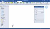
Our new paradigm aims to fix these issues. Let's jump into what it might look like:
From this you might notice a few things:
1. The flow is top to bottom.
2. You are not shown anything you cannot use - UI is exposed as you indicated you need more functionality. For example, if you click Draft, the Draft Angle checkbox is shown.
3. There is much more consistency with fonts, spacing
4. They are theme responsive.
From a higher level, these would be dockable in the work area - to the right hand side or to the right side of the Design Explorer. Or, you can drag them around and place them as you like, similar to what we have today.
We are considering some bits of customization, for example you might find the above examples to be easy on the eyes but you want things to be closer together - we might implement a "Compact Mode" that tightens the margins of the controls, for example, but we are unsure if people want things like that. Large dialogs will have a scroll bar, most likely.
Here are a few examples of some dialog mockups (we haven't coded this yet), some docked, some floating, in various states of expansion:
Let us know your thoughts and if there is anything else you can think of from a UI/UX perspective for this project that you think would make a positive impact.
Attachments
Last edited:
 . Looks great to me!
